


P.S. Zelmanovic are full service photography and production specialists in Croatia with an added value of a studio space that are focused on creating and translating refined ideas into visual and marketable narratives through photography and video. They help makers and brands implement meaningful brand imagery by developing informed and relevant visual concepts.


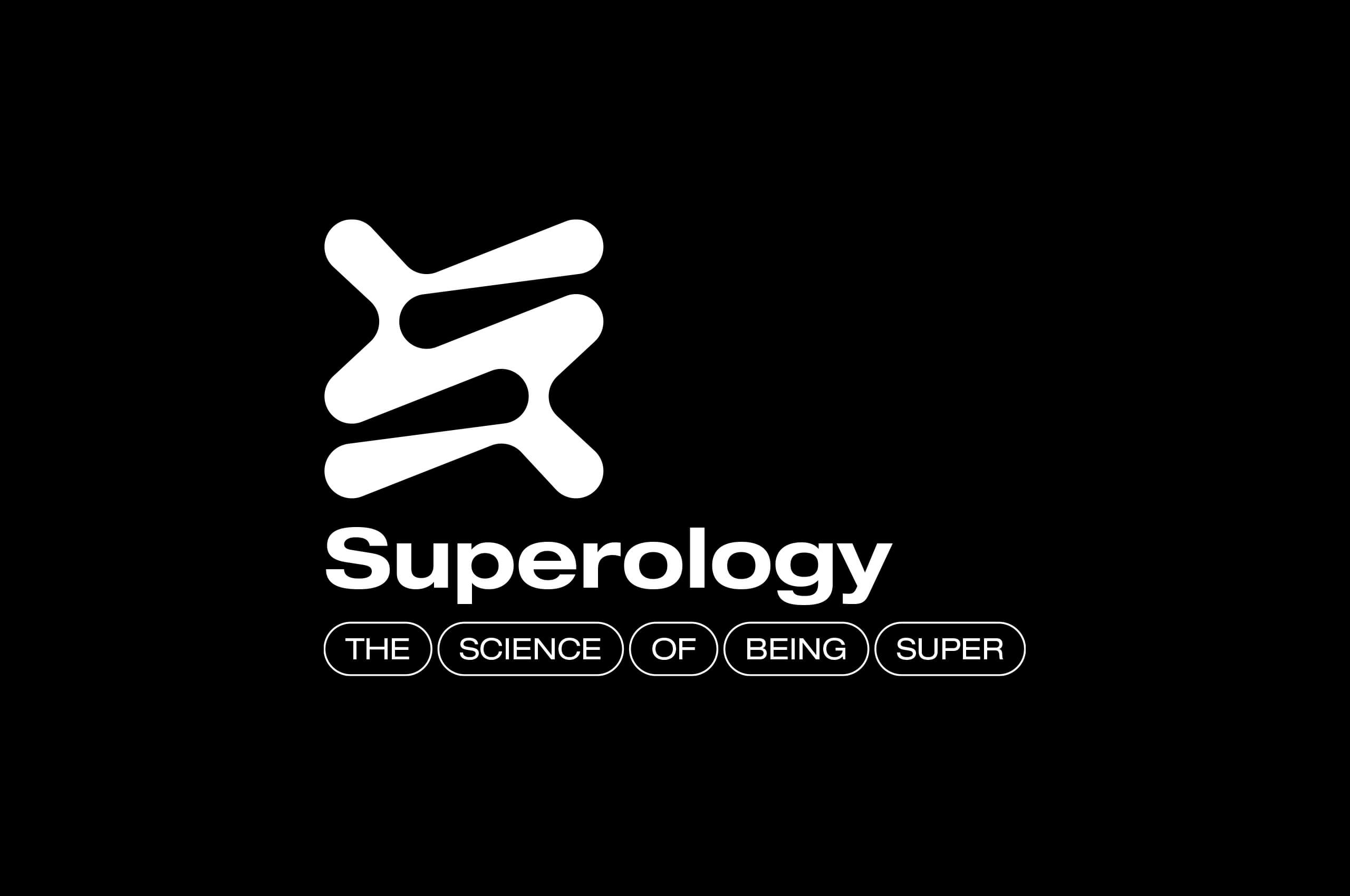


Superology are a B2B tech company which specialise in research & development for real-time sports solutions. They have been developing their own product since 2012 and have recently gained over 1 million customers. To acknowledge this significant milestone, the Superology team have decided to modernise their brand identity.


BLEACHED zine is a publication created during lock-down. Featuring responses from over forty accomplished artists, designers and writers; BLEACHED aims to function as a collective record of the sudden and extraordinary shift we have all experienced with the arrival of Covid-19. The foreword is kindly written by Adrian Shaughnessy. 100% of profits from the sales are being donated to CRISIS UK, helping those who are on the streets during the pandemic. Get your copy on the website www.bleached.info by donating £10+ (inc. UK postage), or drop by magCulture who also stock the zine.
Collaborators:
James Sanderson
Laurie Jackson
Website design:
Max Ryan


The Croatian Cultural Home Sušak is a public institution founded in 2018. It is located on a heritage site in Rijeka, Croatia, and as a newly founded institution it strives to become a recognisable cultural symbol of the city. This project was a public competition, it is not realised.
Collaborators:
Paula Sobat


Bien is a design studio dedicated to giving digital products a thought-out and an intentional user experience. High attention to detail, experience and a thorough understanding of the business side is the way they do it. Visit their website and check out what they're all about on bien.studio


Grain Kitchen is a small, independently-run casual restaurant with a focus on whole grains, their global-inspired menu comprises vibrant and healthful offerings, presented in the form of ‘grain bowls’.
The basis of all the bowls is, of course, the grain itself; they like to discover and use lesser-known as well as more traditional grains, but transform them in a contemporary way to make creative and nourishing dishes. Alongside the grain, they also like to add different condiments or ‘sides` to the bowl; vibrant, seasonal vegetables, textural greens and meat and vegan-friendly protein-rich options.


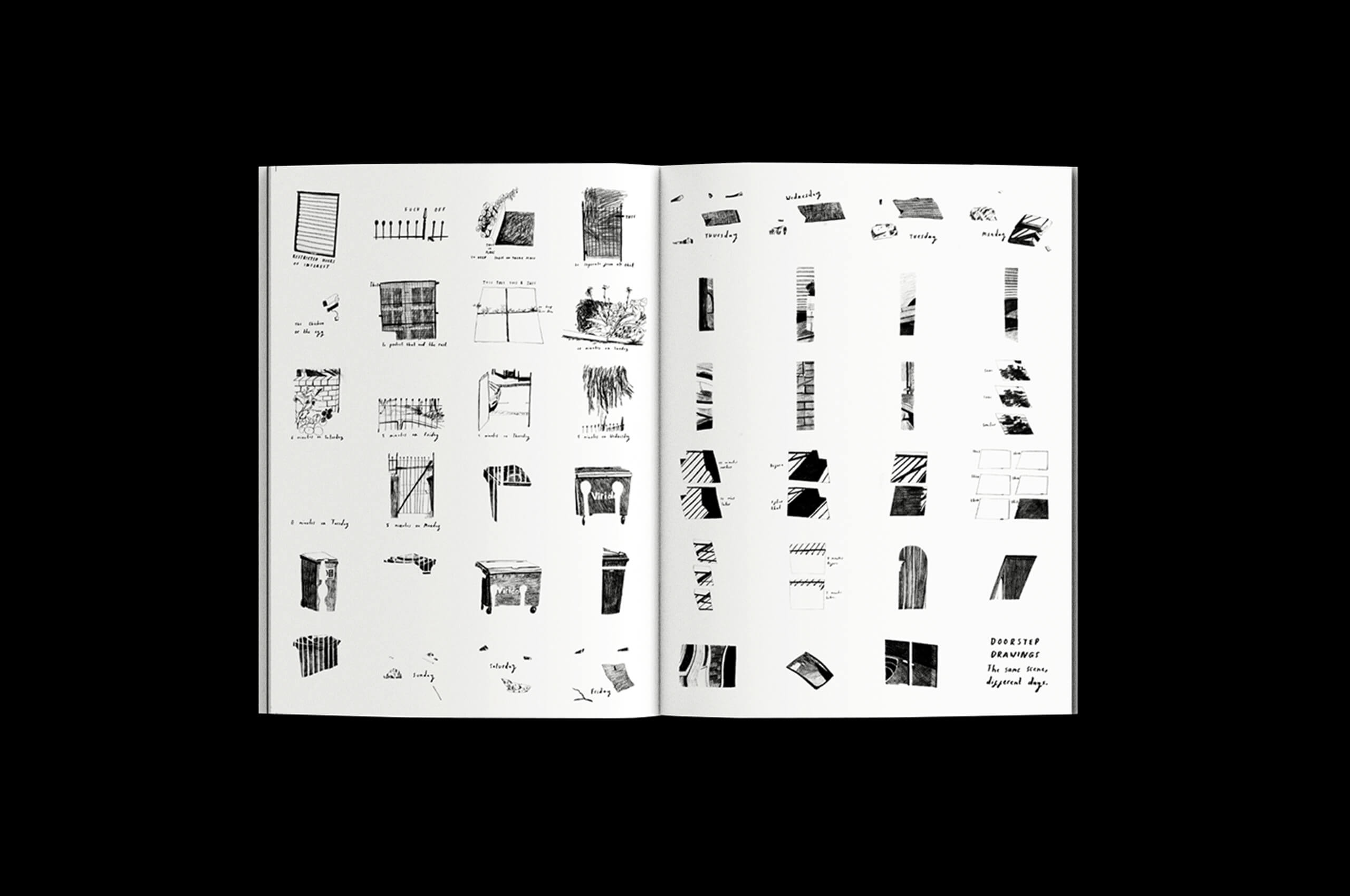
This research focuses on the contemporary phenomenon of copying within the field of visual culture. Working with the notion that the copying process doesn’t necessarily have to be perceived as a tool for de-generation of the context and the image itself, I attempt to explore the act of copying as a contemporary phenomenon through which multiple identities emerge or get ascribed by the transformation of the original artefact’s context.


Layout and graphic design for the MA project thesis by Ema Gerovac.